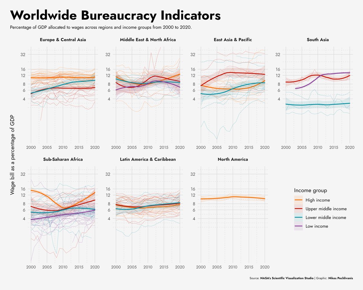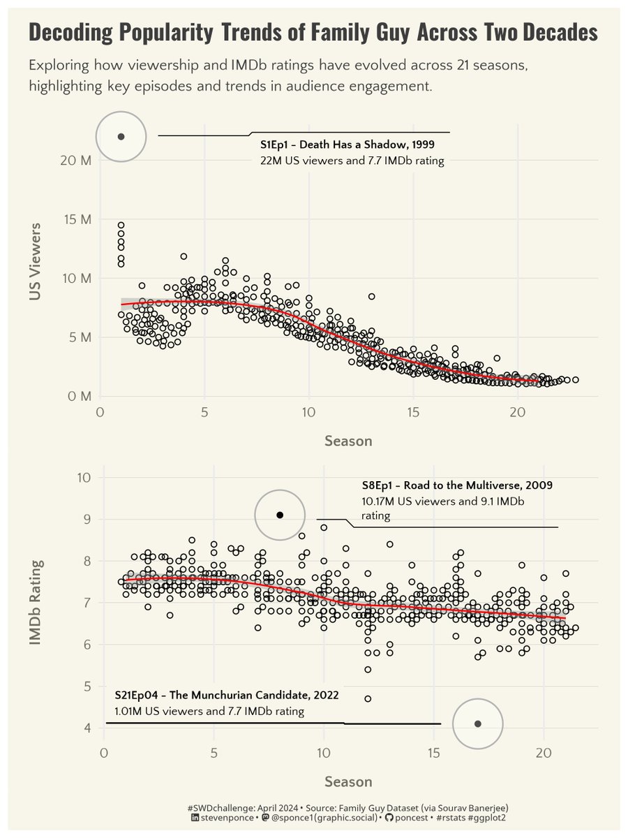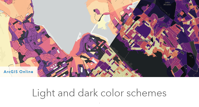


I so much love how versatile Excel is🥰
Made a Brewery sales dashboard with Excel. The purpose of the analysis is to see sales trends and the brands doing very well in the market.
#DataAnalytics #25DaysofConsitencywithWiDA
#dataviz


#30daychartchallenge Crushed a third & rediscovered my love for #dataviz ! This challenge proved I can do personal projects (time excuse = busted!). Now I'm back to my daily job with renewed passion. Thanks for the push #30DayChartChallenge and see you next year!
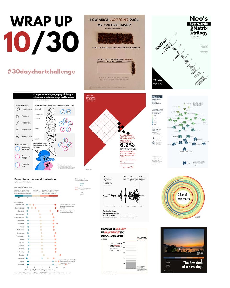


💫💥 Visualización de datos genómicos en #rstats (código disponible) 🤩
buff.ly/49XiqIB
#dataviz #stats #analytics #datascience

Python is a versatile programming language that is widely used for econometrics, statistics, and data analysis. pyoflife.com/introduction-t…
#DataScience #pythonprogramming #DataScientists #dataAnalysts #EconTwitter #statistics #econometrics #dataviz


#data visualization #data science #data #data analytics #machinelearning #data scientist #data analysis #artificialintelligence #python #data viz #bigdata #ai #deeplearning #analytics #data base #technology #data analyst
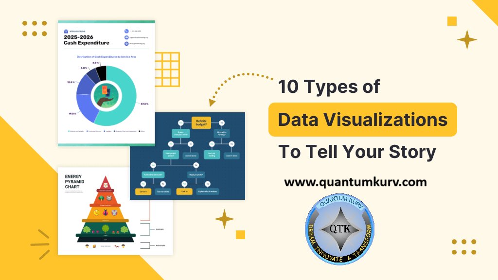
Website: quantumkurv.com


💯🌟❤️📊📈
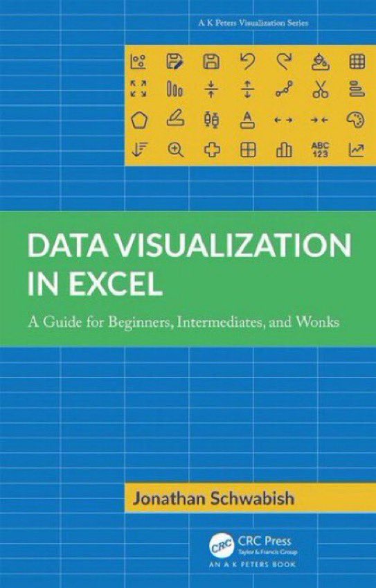
Beautifully published #DataViz books by Jon Schwabish
Better Data Visualizations: amzn.to/3s2jIMX
Others (e.g, Data Visualization in Excel): amzn.to/3sPSLCt
—————
#DataStorytelling #DataLiteracy #Statistics #DataScience #DataScientists #BI #Analytics

I can't give you the world, but I can give you a beautiful, an interactive and insightful visualizations.
#DataScience #DataAnalytics #DataViz #TechForGood #Datavisualization #Powerbi #MSPowerbi


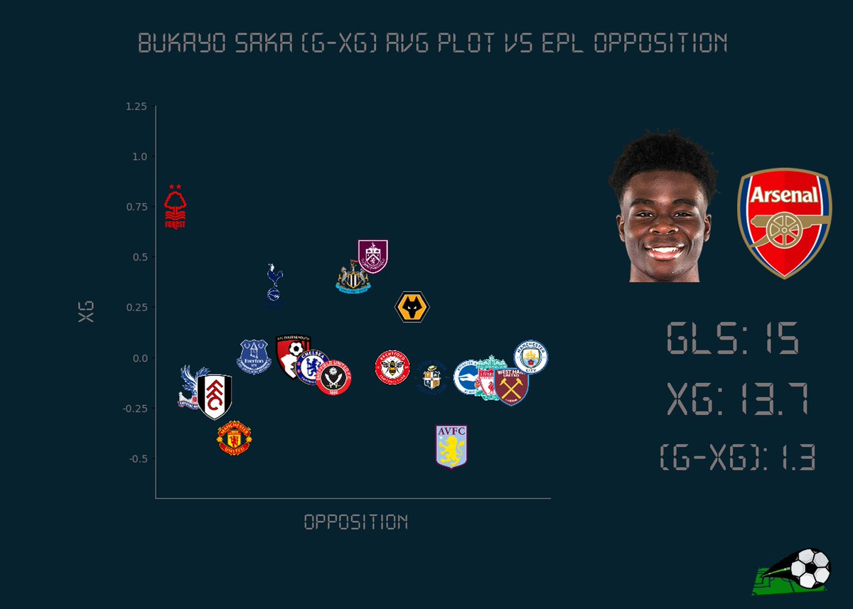
Bukayo Saka xG & (Gls-xG) vs EPL Opposition #xG #ExpectedGoals #DataViz #FootballAnalytics #Arsenal #BukayoSaka

In the world of programming, elegance isn’t just about aesthetics; it’s about efficiency, maintainability, and clarity. pyoflife.com/clean-python-e…
#DataScience #pythonprogramming #DataScientist #DataAnalytics #dataviz #webdev #statistics


Quickly change the timespan to get your perfect chart!
#buildinpublic #spreadsheet #charts #dataviz #DataAnalytics #Excel #workhacks #datainfrastructure #csv
